Sergius Seeks Bacchus: Behind The Cover
Leopold Adi Surya discusses the process of designing the cover illustration for Norman Erikson Pasaribu’s Sergius Seeks Bacchus.
A Designer’s Confession
Sergius Seeks Bacchus is a book of struggle, hope, and compassion. As a book designer – apart from being the one to whom the book is dedicated – being able to witness the whole process of the creation of the book that I was going to design was both a tremendous privilege and an unnerving experience. Sergius was composed when Norman grappled with a months-long depression, which I think was one of the worst episodes he has ever been in. He was facing day-to-day bullying from his past workmates, as much as from the literary communities in Indonesia (which happened after the manuscript won against hundreds of others in Jakarta Art Council Poetry Book Manuscript Competition in 2015). The emergence of Sergius was like a strike of light in the middle of a vortex of total darkness. I was then afraid that whatever I made for Sergius would end up failing to capture the transformative essence of the book. Obviously, I wouldn’t be able to draw all the experiences that Norman had undergone throughout the genesis of Sergius. I was overthinking, and yet the thoughts turned me blank, completely. It was not that I have never dealt with any creative blockage before, but facing Sergius was like facing a no-win scenario. I have not felt the same pressure with any other book since I have always been aware of the vast distance between their authors and me. Sergius, on the other hand, is a personal journey, a part of the poet’s life which I have witnessed and which has melded with mine (Norman and I had already been in a relationship for about a year during that time). And to conclude that journey within one illustration would not do any justice to what had truly happened (what would be enough anyway?). The funny thing is, it was Norman himself who kept calming me down – glad that he is also a Jovian empath! – and put me on track. The moral of the story was unsurprising at best but could not be any truer: it is just impossible to entwine all the strings when they aren’t meant to be. As far as the final design is concerned, my only hope is that it could at least depict just a tiny bit of the light that Sergius Seeks Bacchus had brought along with their turbulent incarnation.
The Design in Process
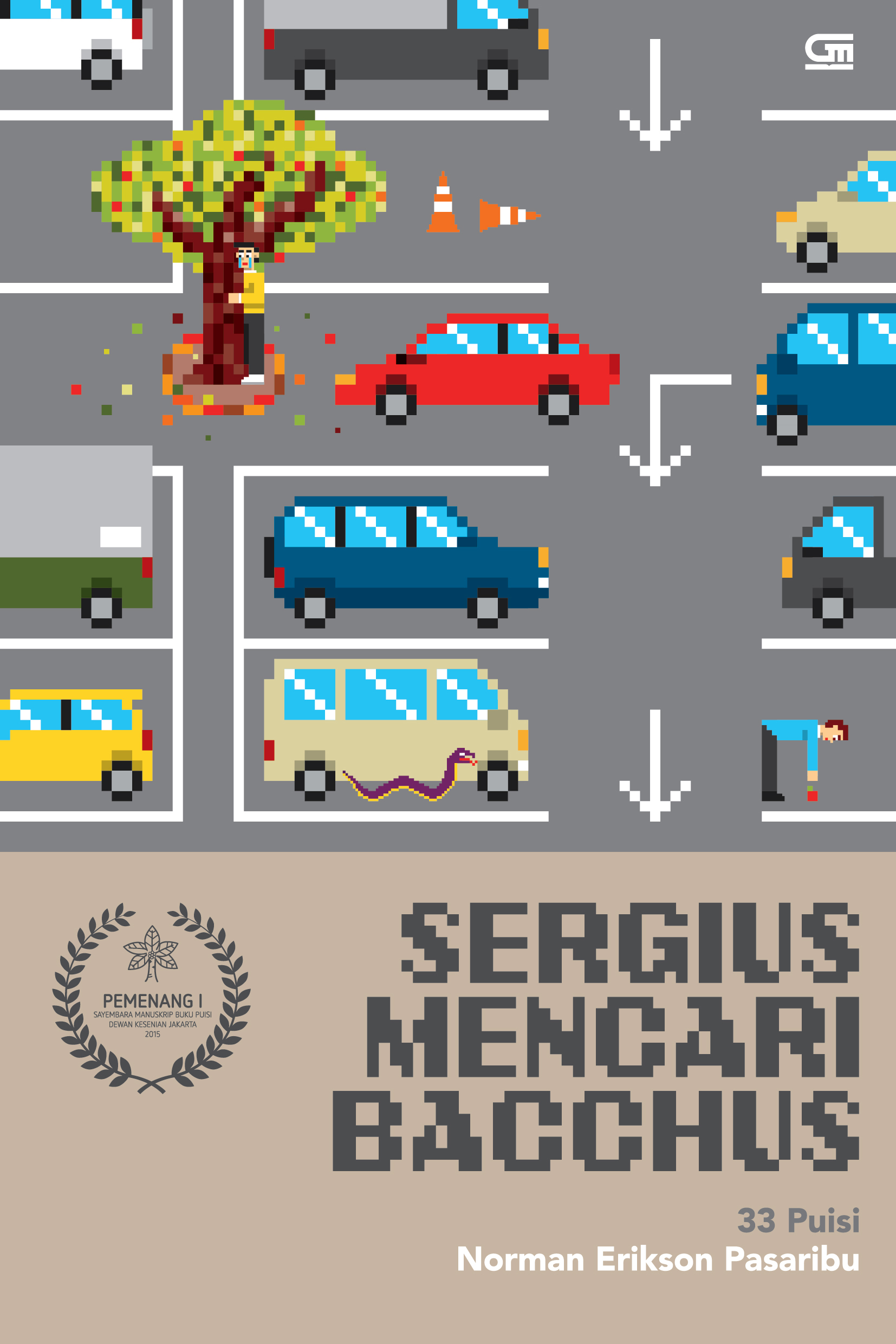
The first Sergius cover that I designed was the Indonesian edition, published by Gramedia Pustaka Utama in 2016. I made the illustration in pixel art style to reflect the playful nature of the collection. Sergius is a mixed bag of poetic styles; it nods to the classics and to contemporary poets. And thematically, it is a synthesis of the spiritual and the mundane, a mashup but not in a gaudy way. Therefore, in order to chromatically visualise these contradictory aspects – to create a contrast that is clear-cut yet not too stark – I combined the bright-warm colours with the beigeish-greyish tone. The depicted poem was ‘Ia dan Pohon’ (‘He and The Tree’). Norman and I chose to depict this poem because of the symbolism of the ‘three branched-God’ that reappears within the collection. A little trivia: the first title that came up to Norman for the collection was ‘Seperti Pohon’ [‘Like a Tree’]. And a tree, or to be exact: the hariara tree from the Ficus family, has a cosmic significance in the Batak pre-Christian spirituality. It is believed that the Lower World, the Middle World, and the Upper World are connected by a hariara tree.
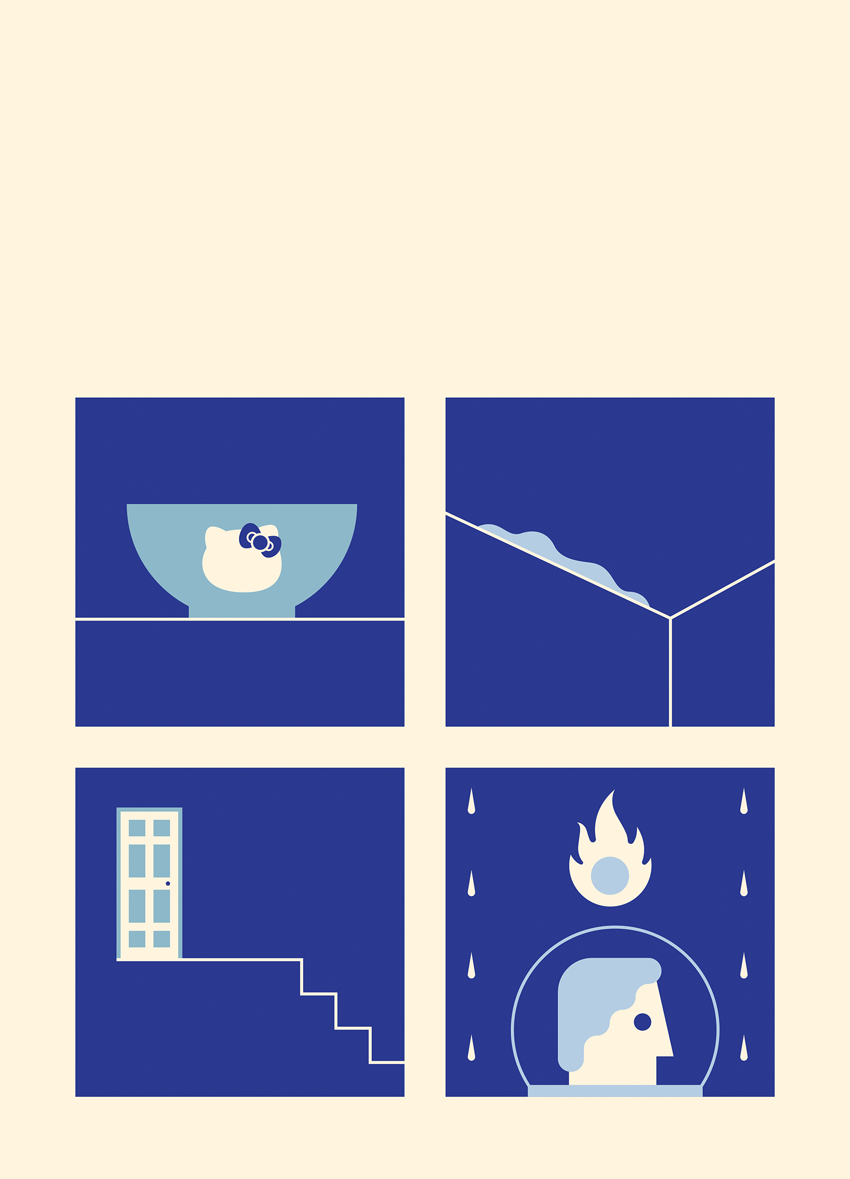
For the English edition, I decided to take different approaches. And this time I only did the illustration and not the layout.
I read the manuscript, which Tiffany Tsao had translated with Norman, and happened to feel that some of the poems have a slightly different tone than in the original Indonesian. For example, the poem ‘Are You Still There at The Station?’ sounded as if it was spoken to Adi (the person to whom the poem is told) that is older than the Adi in the Indonesian one. The tone was somewhat heavier, yet more gentle. Even though in both versions the overall narrative of the poem felt like a slideshow of memories, it felt more inconsolable in the translation (kudos to the hardwork of Tiffany and Norman). Departing from this idea of ‘a slideshow of memories’, I composed four images, made it as snapshots of scenes, which were taken from four different poems in the book. Using a tender colour tone, I wanted to reflect the soft and nostalgic side of the collection.
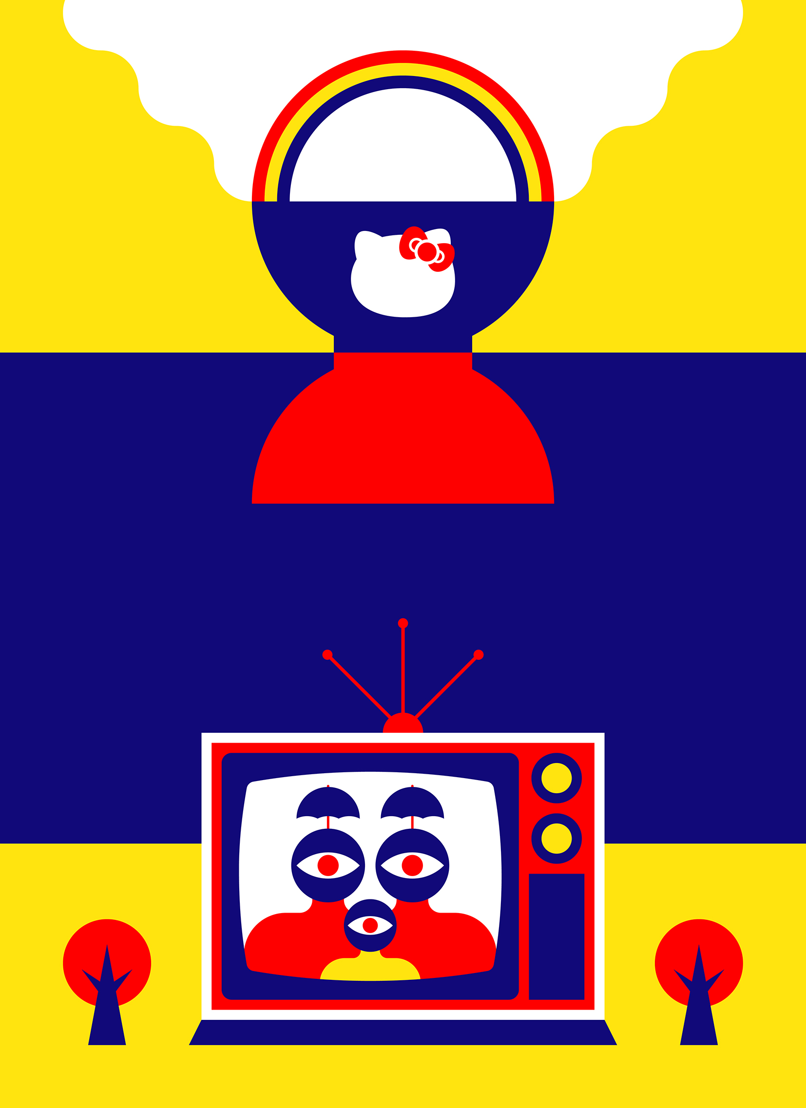
The next approach was highly inspired by the works of Fernand Léger and Tadanori Yokoo – I was looking a lot at their works around the time of working on this one. I intended to adapt their style and mash it with the weird and speculative ideas from Sergius, especially from the last poem, ‘A History-to-Come of Helmbrellas: Their Features and Fate’. I depicted the scene where people were wearing bizarre helmbrellas. The colour scheme was intended to be highly vibrant, as the final poem is.
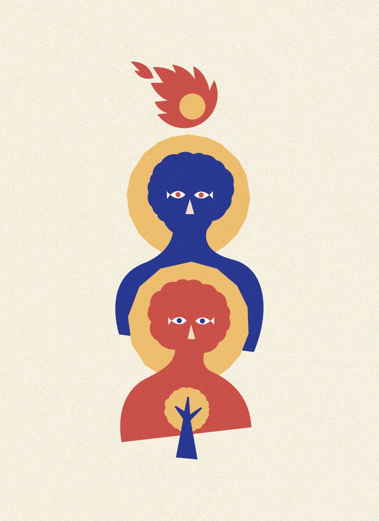
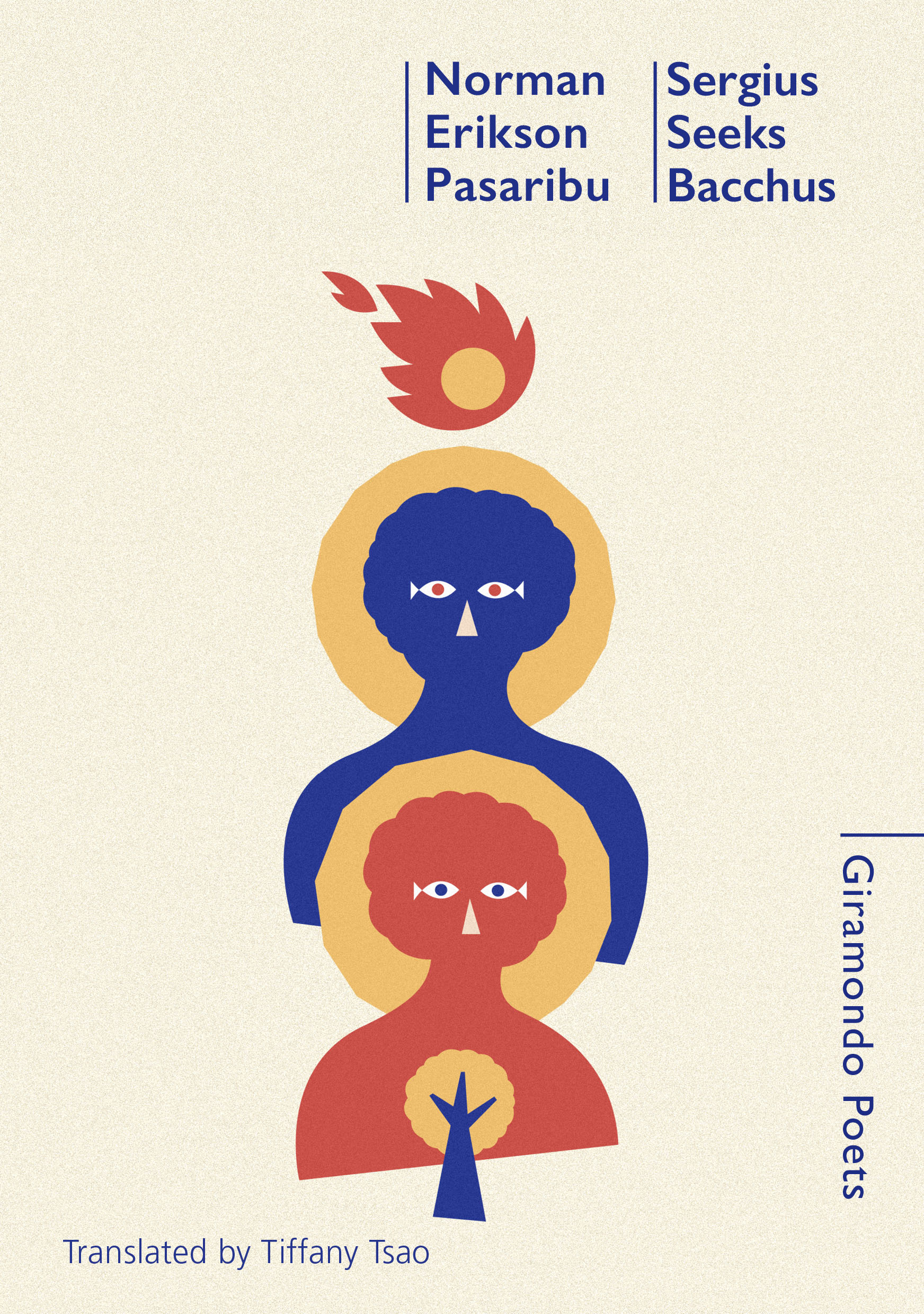
For the final approach, I finally went back to the title poem. The human figures were the stylised version of Sergius and Bacchus painting from the 6th–7th century. The overall illustration style was inspired by the cut-out works of Henri Matisse. Although what I made is not at all a collage illustration, I adopted the collage method of depiction as a way to modernise the images of the saints, yet with the colours toned down from Matisse’s colour scheme, so that it resonates with the tender quality of the poems, as I have done with the earlier approach. However, the illustration was not merely a depiction of the title figures. I put some symbolism here and there. The eyes of the saints are pair of fish, which is the symbol of Christ, as well as the symbol of the zodiac sign Pisces, which happens to be the Sun and Mercury sign of Norman. The yellow halos of the saints could also be the helmbrellas. And the meteor-like shape on the top of the image is the part of the ‘Holy Spirit Helmbrella’ from the final poem (No. 13: ‘the fireball seemed to hover/ above the wearers’ head.’). The way it somehow resembles a meteor, or a falling star, is a reflection of how the Christian belief is very concerned with the fulfilment of the Second Coming (see how Norman put the final poem in the collection, which speaks about the end of the world and the beginning of a new one, reflects the Revelation in the Bible?). This final approach is a more unified combination of both the classic and the contemporary aspects of the collection, since it blends the contradiction within one image. It shows the spiritual side of the book in a more obvious way than the Indonesian one. What I hope is that the design could echo the transformative essence of the book, and that it would also touch general viewers with its gentle hues and modern look.

Leopold Adi Surya is a Jakarta-based graphic designer and illustrator. He holds an MA in Design from the Manchester School of Art. He occasionally writes fiction, and some of his short writings have already been published in the mainstream media in Indonesia, including VICE Indonesia.
Website: gembalaelektrik.com
Instagram: @gembalaelektrik
Twitter: @gembalaelektrik
